Are you ready to learn a little about redesigning your website? I’m Spencer Ploessl, the Creative Director at Synecore in Minneapolis, Minnesota, (USA). As an integrated digital marketing agency, we have dealt with our fair share of website redesigns. Today, I sat down with Jacey Gulden, our web designer extraordinaire, to ask her about how a company goes about redesigning their website. By knowing the best practices of web design, you will be able to determine what your next steps are and maybe even determine how to assess what you are looking for in a successful designer.
Spencer Ploessl: Let’s say a company wants to redesign their website. Where do they begin? Should you bring in a designer or hire a web design agency?
Jacey Gulden: Unfortunately, simply wanting a redesign isn’t enough for a designer to base their project on; it is imperative to have a quantifiable reason(s) why. For example, if you think you are in the market to revamp your brand’s online presence, enlist website analytics software to help calculate why you think your website needs improvement. It will provide useful performance metrics such as your bounce rate, conversion rate, traffic sources, and unique visitors. This type of information can provide you quantifiable feedback as to why you need a redesign, and what direction to take it.
Spencer: So, once you have identified your needs, are you ready to hand off the baton to your designer?
Jacey: Not quite. This second step in your redesign is when you want to collaborate with your designer.Once you have identified your needs, it’s important to map them out.
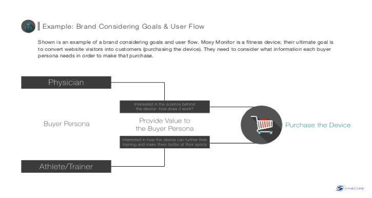
Put yourself in the shoes of your target audience or buyer persona and determine how you want them to flow through the website.
By creating a sitemap, you can see how each page will live on the website. Then you can decide things like, “do we have too many pages? Not enough? Is the content crowded on some pages?”
For example, in an “ABOUT” page, you could have all the content on one page OR choose to have linked pages for further information on your team members, company history, and career opportunities. These subtle changes give you more granular analytics on why visitors are going to certain pages and allow you to more accurately gauge the success of your design.

Spencer: Wow! That sounds like a really complex creative process. For a business owner that may not know too much about website design, how do you know how you want your visitor to transition from page to page?
Jacey: Like any creative process, take cues from others’ successes. Gather inspiration from competitors’ websites, or even those from other industries – any sites that you think work well. However, this is for inspiration and should not be confused with copying or replicating someone else’s work. Mimicking another website is not innovative. Select themes you like but then make it your own. Let your unique design stand out!
Spencer: Now we have determined our goals and mapped out how we will be addressing those needs, are we ready to jump in?
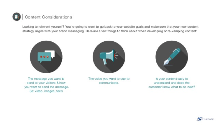
Jacey: Just about! Knowing how we will be using the content on the website will help guide how to design the website. For example, does your industry tend to rely on a heavy use of graphics or photos? Is it text heavy? Will you be using videos?
Spencer: So, what you’re saying is that the content drives the design?
Jacey: Exactly! By making sure your content is consistent with your goals, you create a cohesive message and experience for your visitor. For instance, does your brand use an informal or formal voice?

Spencer: This content that you are referring to, is it more than the basic information on your website or product pages?
Jacey: Yes, much more. It also includes blogs, premium content pieces (like ebooks, webinars, etc.), even the copy you use to describe yourself on your social channels. While some facets of your brand, such as your social channels, may not be directly correlated with the redesign, they provide insight to how you are already engaging with your audience. As you could imagine, a focus on LinkedIn would be considered a more formal voice, whereas Facebook would be more informal. One isn’t better than the other, just based on what is best for your brand.
Spencer: You mentioned blogging – what types of businesses are cut out for blogging?
Jacey: If you think of your website as your online storefront, then your business blog is your best sales representative. It allows your company to produce new and relevant content without revamping your whole website. A blog is a great tool for any business to answer consumer questions without the formality of that dialogue. Internet searchers are looking for answers to questions and your blog is a way for your company to respond to those requests before they are even posed!
According to Hubspot, 92% of companies who blog multiple times a day have acquired a customer from their blog.
That’s a pretty convincing statistic. While you may not have the resources to blog multiple times a day, aim for consistently publishing a post at least 3-4 times a week.
Spencer: That’s a great tip! We have now covered setting goals, creating a consistent visitor experience, and the role of content in this process. When do we get to the fun part?
Jacey: Once we have accomplished the nitty-gritty aspects, we are finally ready to dive into the actual design. Our design team will then work on brainstorming, creating wireframes and mockups, and then designing and developing. Taking into account the preferences of our target audience and relevant website trends, we will create a website that connects and converts (hopefully).
Spencer: What would be an example of a website trend?
Jacey: I see a lot of people wanting to utilize Carousels or sliders right now. But when looking at the functionality, only 1% of visitors will click a feature, and of those that do click, 89% will click the feature in the first position. It is a very attractive design element; but, when trying to capitalize on that prime real estate by having your important content on a rotating slider, it may not be as effective as you would think.
Spencer: As there will be some content that is below the “fold” that a visitor needs to scroll to see, what is the best way to prioritize how your website content is laid out?
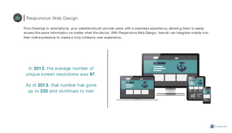
Jacey: With any website, there will be some classification of content hierarchy. What is important to consider is how that pyramid of content will appear on a variety of devices. If you choose to develop a responsive web design, then your visitor experience will be consistent, no matter if they are accessing your website from a desktop, laptop, tablet, or smartphone. It will automatically adjust for the type of device’s screen size, etc. An added benefit, since it is one dynamic website, you only need to update one website when necessary versus updating your primary domain and the “m.” or mobile website.
 Spencer: Whether you choose a responsive web design or choose to optimize your website separately for desktops and mobile users, we have finally developed our new website! Is that it? Can we sit back and enjoy a cold one?
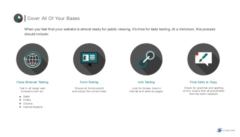
Jacey: Almost. We still have to test our design. It is best if you perform cross-browser testing by checking what the website will look like on Safari, Firefox, Chrome, and Internet Explorer. Additionally, do some link testing and set up any 301 redirects for broken links. Lastly, do any final edits to copy. While it may seem like a simple task, using the correct grammar and spelling is of grave importance. Something as trivial as misspelling “manager” occurs far too often, especially when a spell-check program will not recognize using “manger” in the context as incorrect!

Your redesign may not be perfect right out of the gate, but, learning from your testing and analysis, some final tweaks will make your website sparkle. There are some online services that offer analytics for your website pre- and post-launch. Crazyegg, Mouseflow, and UserTesting are all worth mentioning. While each offers different scopes of data, they are all useful when assessing how well your website is performing.
Spencer: Whew. That is a wealth of information! Anything you want to add? As a designer, what would be your biggest challenge?
Jacey: Ha, I guess a #designerproblem is when someone approaches me to do a redesign and their reasoning is that they “don’t like the way their website looks.” Without having a clear direction of why, you are starting the project with the challenge to determine why you want to alter the existing website in the first place. But with a little investigation and open communication with the client, it is relatively easy to uncover the reason.
Spencer: A very diplomatic answer. So, start with your goals, map out your needs, create consistent content, followed by designing and developing, then finally test and analyze. You make it sound almost simple! Thanks so much for providing your expert insight on this topic. We had fun picking your brain! You provided us with very clear steps on how to begin the process to get the most out of your website redesign.
